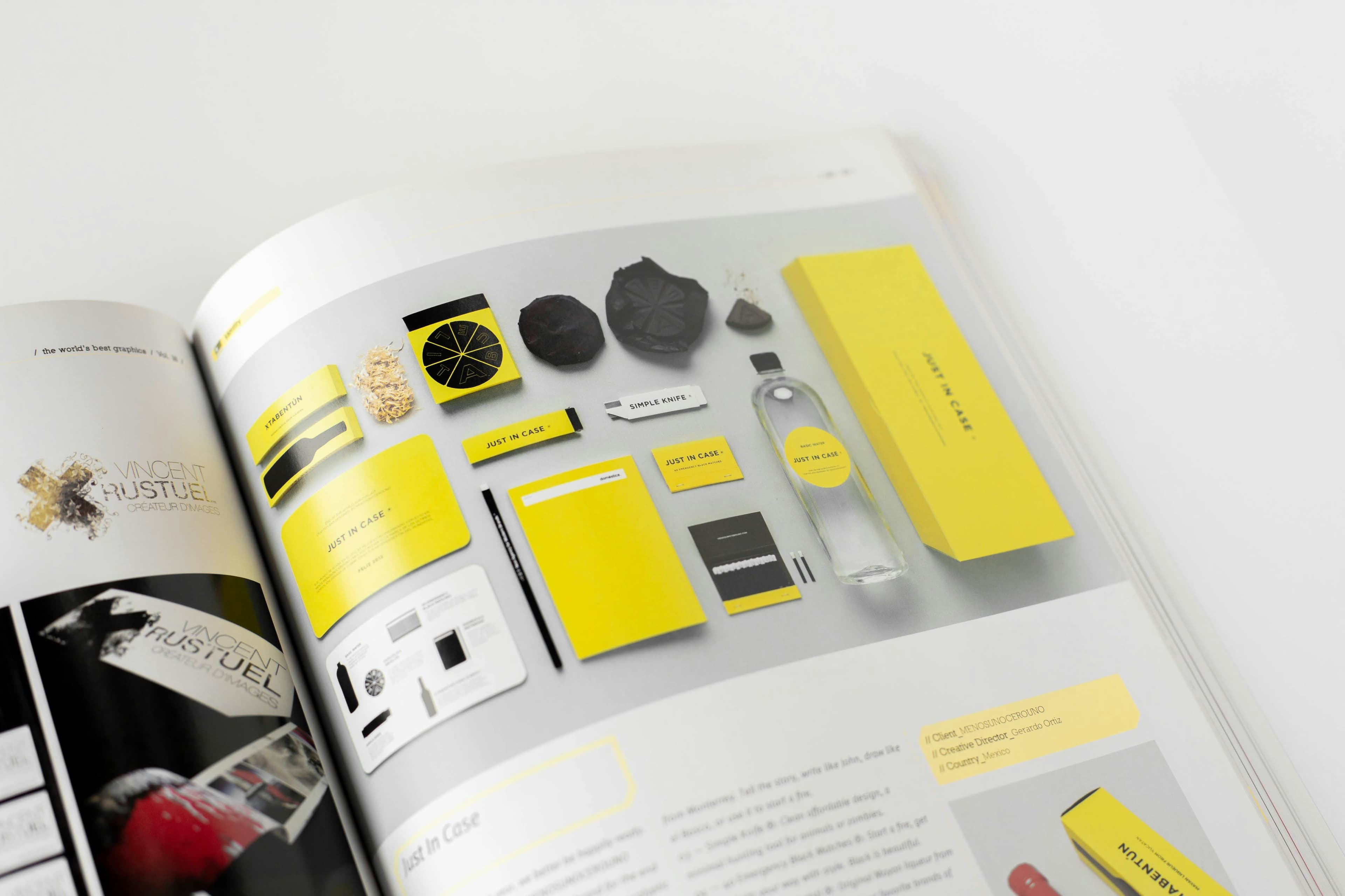
Brand Identity
Brand Refresh
Led a full brand identity refresh for a 12-year-old Australian skincare brand expanding into European retail. The rebrand needed to honour the brand's heritage while signalling a new chapter — moving from mass-market pharmacy to premium wellness positioning.
Tools Used

The Challenge
The existing identity had accumulated inconsistencies across fifteen years of different designers and marketing managers. There were three versions of the logo in active use, four different primary colour treatments, and no defined typography system. Retailers were requesting a more premium feel before stocking the expanded line.
The Solution
We distilled the brand to a single refined wordmark with custom letterforms, a pared-back palette of warm off-white, deep forest green, and burnished gold, and a typographic system built around a variable serif paired with a humanist sans. The new system shipped with a 60-page brand guidelines document and a Figma token library for the in-house team.